Blog
Occasional posts on subjects including field recording, London history and literature, other websites worth looking at, articles in the press, and news of sound-related events.
Rebranding exercise
GOT FED UP with the old London Sound Survey masthead, finding that it was looking more odd over time, like when you say the same word over and over again until it sounds unfamiliar and meaningless.
The new font has the resonant name of Decorated 035 OT, and on the old Letraset sheets it was identified as Profil, sounding more elegant than it looked. But why that font?
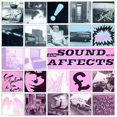
It looks a little bit like the one used on the cover of a Jam album . . .

. . . and it appears on the sign of a shop in Kingsland High Road, which maybe sells wigs. Also, in an earlier life working for a printers, I used to see it every month or so among the camera-ready artwork for a police staff newspaper.
A regular strip of feeble one-panel cartoons had the single word HUMOUR hanging over it like a grand piano waiting to fall on someone. As for the font – well, you get the idea. Irony? No, not really.
Do also note the array of shiny-looking social media buttons to the right and have a go at clicking on them. Come on, help me out here.
ABOUT SOUND
FIELD RECORDINGS
The balloonist in the desert is dreaming
The Binaural Diaries of Ollie Hall
GEOGRAPHY AND WANDERINGS
The Ragged Society of Antiquarian Ramblers
LONDON
ORGANISATIONS
Midwest Society for Acoustic Ecology
World Forum for Acoustic Ecology